Ranking Illinois Flag Redesigns
First published: Saturday January 18th, 2025
Report this blog
Dislaimer: I am not Illinoisian at all.
Rankings

#1
My Opinion: I like the gear/corn symbolism, but the colors are muted and similar
Given Explanation: "The four dark blue bars in this submission represent the four geographic features that hold the greatest geographic, economic, and historic significance in the creation of Illinois: Lake Michigan, the Mississippi River, the Ohio River, and the Chicago River/ Illinois River system. The corn kernels and 21 -pronged gear that form our state flower, the violet, represent the agricultural and industrial foundations of our state and its status as the 21st state admitted to the Union."
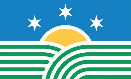
#2
My Opinion: Looks a bit more like a logo, and the fields are a bit complex. Like it though.
Given Explanation: "The 21 stripes represent Illinois as the 21st state and reflect its agricultural roots, resembling rows of crops and the open prairie. Three six-pointed stars represent the state's three regions *northern, central, and southern* and their 18 points reference Illinois' founding in 1818. A sun on the horizon, also featured on our current state flag, represents renewal. The colors *Blue for unity, Green for agriculture, and Yellow for a bright future* honor Illinois' history and natural beauty."
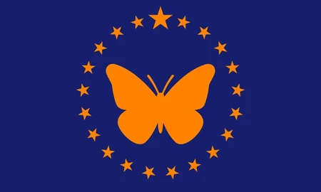
#3
My Opinion: Colors go well together, but looks like a seal-on-bedsheet, but with a butterfly instead. Doesn't have much going for it except the butterfly.
Given Explanation: "The state butterfly, the Monarch, is the focal point of this flag that includes 21 stars for Illinois being the 21st state (the large star represents Illinois). The orange represents success, determination, and creativity while the blue stands for trust, loyalty, and sincerity and strength."
Note: These top three are very similar in ranking and I could be swayed to put any at #1
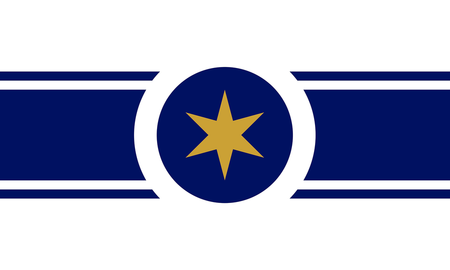
#4
My Opinion: Looks a bit simple and the circle seems unfinished. Also looks like a city flag more (see Chicago and DC).
Given Explanation: "A large gold Star in the center draws attention, much like the standout features of our state. Gold color symbolizes out the richness in our state, people, land and views. A horizontal blue line symbolizes Lake Michigan, separating the sky from the rich land. Two smaller lines add a neat, elegant touch. The central circle abstractly represents the view from above Abraham Lincoln's hat."
#5
My Opinion: Only two colors, and star placement looks a bit off. The meaning given seems like a stretch.
Given Explanation: "The flag is divided into 7 stripes, in a pattern of white and blue alternating. The biggest blue stripe represents Lake Michigan while the smaller blue stripes represent the state's various rivers such as the Mississippi and the Illinois. The center blue stripe contains 20 smaller stars surrounding a center star, which represent Illinois as the 21st state. The small white stripes represent the state's industry and commerce while the bigger white stripes represent the state's agriculture."

#6
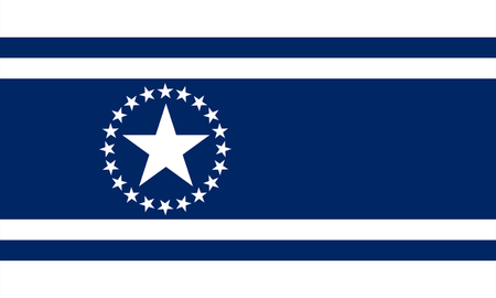
My Opinion: Why all to one side?
Given Explanation: "The Centennial Flag was created to commemorate 100 years of Illinois being a state. The flag consists of 10 stars on each side of a white and blue banner with a large star as the 21st to represent the state being the 21st to admitted to the Union."
#7
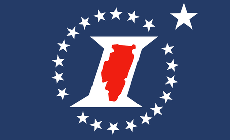
My Opinion: The red goes good with the blue. Having a large I and the state inside that is not good though.
Given Explanation: "The Sesquicentennial Flag was created to commemorate the 150th anniversary of the state. This flag is dark blue with an outline of Illinois in the middle of a white "I". The center is surrounded by 20 five pointed stars with the 21st star larger to represent that Illinois was the 21st state admitted to the Union."
#8
My Opinion: Less color than the above, and suffers from the same flaws as it.
Given Explanation:
#9
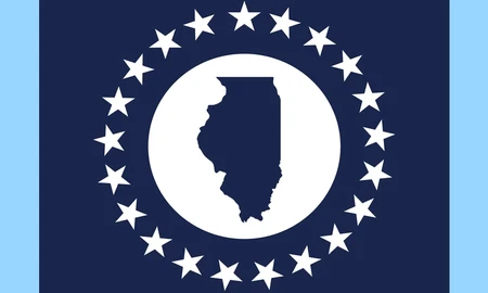
My Opinion: Has egregious Lincoln inside Illinois, but better than below.
Given Explanation: "The outline of Abraham Lincoln symbolizes liberty, opportunity and the equality of all people. The outline of Illinois symbolizes the pride we share for our state. The circle of 21 stars represents our communal togetherness and honors our state being the 21st to join the USA. The white star symbolizes Chicago and its upper-right location. Dark blue represents our blue-collar attitude and industrial power. Gold represents our prairie and agricultural history. White represents our bright spirit."

#10
My Opinion: The "I" is crazy big. I saw an article ranking this #1, which imo is insane.
Given Explanation: "The 21 red + white stripes represent Illinois as the 21st state of this union. The blue field with the six-pointed white star represents Chicago. The negative space between the blue and white fields form the shape of an I to represent Illinois."
#11
My Opinion: Better than the below by removing name but I hate that it was only submitted to save money. Also the designer is the only one to not have lived in the state, I believe. Me neither but eh.
Given Explanation: "The idea of mine is simply an embellishment to the existing flag (helps to save money on an entire new design). Placing red and blue vertical bars on each end (with a narrow white stripe in between the colors) eliminates the 'seal-on-bedsheet' look. Not overly imaginative, but practical and economic."
#12
My Opinion: Just a seal-on-bedsheet
History: "The first official flag of Illinois was adopted in 1915, almost 100 years after Illinois became a state in 1818. Lucy Derwent of the Rockford Daughters of the American Revolution chapter had placed the Great Seal on a plain white background. In 1969 the word "Illinois" was added to the bottom of the flag, becoming the flag that is recognized today."
#13
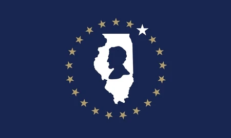
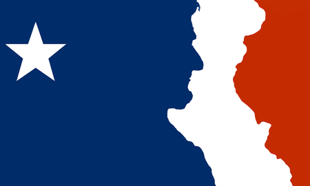
My Opinion: Has egregious silhouettes, and the negative space between the large Lincoln and Western Illinois is horrible. I saw an article ranking this #2, which imo is insane.
Given Explanation: "This slice Of Old Glory is also a nod to the French flag! banners which both stood here. A single Star shines our contribution to the union. Abe's silhouette reminds us of our past. The red field highlights our present: Illinois' most iconic border, formed by the mighty Mississippi. It's steady flow, as progress itself, cuts through our banner in white leading us ever to the future. The flag still lacks any representation of our Illiniwek and Miami heritage, which should be added by their progeny."
- Neodymium
2021core
your bottom three is my top three prolly
Is this serious, or masterful trolling? It's a circle lmao