
This is my takes starting from New Years Day going on to the cumulation of April.
Will be updated depending on if I ever get premium again.

This maps out my puzzle Takes Vs my quiz takes as a percentage of my total takes

I created my account in November 2025
This shows all my takes each month.

This chart maps out Autism diagnosis by U.S states.
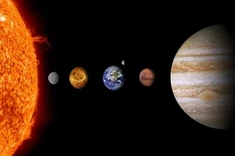
Here is a chart comparing the orbit time in days the to radius in Earth Radii, a scale with Earth's radius as 1 and every other planets radius is compared.

A month ago I made a message board thread about JetPunkers favorite numbers. Here is the data visualized from that thread. The Thread
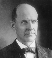
Arguably one of the best American politicians, this socialist presidential candidate ran for office a total of five times. This graph models his improvement through the percent of votes received
Arguably one of the best American politicians, this socialist presidential candidate ran for office a total of five times. This graph models his improvement of raw votes

This chart portrays the cities which are adopting Electric Cars the fastest

This chart compares the top 7 U.S cities with the most electric cars registered in 2024