Sort of Simple HTML (Part 4)
First published: Saturday August 23rd, 2025
Report this blog
Welcome Back - Time for Part 4!
After we structure a webpage, we may want to 'animate' some parts of it, instead of giving it a static look. That's where keyframes come in! Using keyframes, we can alter the attributes of an element and create a smooth animation based on your inputs, making a webpage more dynamic. Let's get into it!
Defining @keyframes
Similar to how we use classes, we use @keyframes to tell the browser that we're, well, about to use keyframes. Note that keyframes are a part of CSS, so you must use an external file or nest the code inside a <style> tag in order to use them.
------------------------------------------------
@keyframes { }
------------------------------------------------
That's how you''ll start crafting your keyframes, then all your code will be inside the curly brackets. But we're missing something - we have to name this animation. Just add a space after @keyframes (only one name can be used).
------------------------------------------------
@keyframes test { }
------------------------------------------------
Now we've named our animation 'test', so we can uniquely identify it and use it as we wish. However, if we named it 'animation test', this would be invalid. Naming a keyframe has the same restrictions as naming a class or ID.
Getting @keyframes
Using the animation attribute, we can add the animation into our styles. You can do this wherever you wish in CSS and apply this to an element.
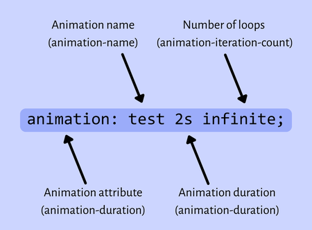
You can use the animation attribute as shown above, or, alternatively, you can use each individual attribute separately. They work the same.
After adding the animation attribute, you enter the name of the animation, the duration of the animation (can be in seconds, s, or milliseconds, ms) and how many times the animation will play, either infinite, or a positive integer.
Now that we can assign the animation to an element, why don't we start creating the animation?
Making the Animation
Essentially, what we're doing is defining the styles for each frame of the animation, and the browser automatically moves between them, creating a smooth transition.
Inside our animation, we use percentages to define how long each part of the animation is going to take:
------------------------------------------------
@keyframes test {
10% {}
50% {}
100% {}}
------------------------------------------------
Nest these inside your animation, and after the percentages you'll define the styles for that frame. These can be anything to desire. Here, I'll use opacity to give the element a fade effect!
------------------------------------------------
@keyframes test {
0% {opacity: 0;}
50% {opacity: 1;}
100% {opacity: 0;}}
------------------------------------------------
Then, we'll give this animation to a <div>:
------------------------------------------------
<div style="animation: test 2s infinite;">Test</div>
------------------------------------------------
Now, after adding a few styles and playing this animation, we can see a smooth transition from opacity: 0 to opacity: 1 and back!
Wow! Just like that, you can already use keyframes. But of course, they can do much, much more. You can add delay, apply multiple animations, change the direction, add a speed curve, change behavior...yah, coding isn't simple.
Customizing @keyframes
There are three important attributes you'll want to use to further manipulate a CSS animation:
| Attribute | Description |
|---|---|
| animation-timing-function | Controls the speed curve |
| animation-direction | Changes the animation direction |
| animation-delay | Controls long much time passes before the animation starts |
Animation Timing Function
Using the animation-timing-function attribute, we can change the speed curve of our animation. Here are the main ones that are used:
| Type | Description |
|---|---|
| linear | This makes the speed constant throughout the animation |
| ease | This is the default - slow at the start and end and faster around the middle |
| ease-in | Starts slow, ends fast |
| ease-out | Starts fast, end slow |
| ease-in-out | Similar to ease, but more emphasized |
| steps(#) | The animation is split into a certain number of steps |
| cubic-bezier(x, y, x, y) | Used for lots of customization |
The complicated part here is the cubic-bezier property. This is a bit tricky to explain, but essentially, the X value is the time, and the Y value is the progress. Your bezier property will always have four values, an X and a Y at the start and two at the end. Look at this code:
------------------------------------------------
animation-timing-function: cubic-bezier(0.1, 0.9, 0.9, 0.1)
------------------------------------------------
What this does is tell the animation timing, when you're at 10% of the animation duration, (this is 0.1; the X values are usually between 0 and 1, 0% and 100%) you should be 90% done with the animation itself (this is 0.9, the Y value). So, once 10% of the animation has passed, you're nearly done.
Since there are X and Y values, there are two 'control' points. So, the second X value (0.9) and Y value (0.1) is where the animation will end.
Hopefully that isn't too confusing (writing that section was the most confusing part of this blog...). Here's the difference between using different animation timing properties:
Uh oh.The box is completely static. Defining more than one @keyframe on a blog seems to not work. I can only define one. Sorry.
Animation Direction
Next up - or, in reverse - is the animation-direction attribute. Now, this doesn't literally change the direction of the animation itself, but how it'll run. Luckily, there are only four properties to give animation-direction:
| Property | Description |
|---|---|
| normal | Default - plays the animation from start to end |
| reverse | Plays the animation from end to start |
| alternate | Plays the animation, alternating between forward and backwards |
| alternate-reverse | Similar to alternate, but starts with backwards |
These will save some clutter in your animations. Instead of having an animation go from opacity: 0 to opacity: 1 and back, you can use alternate so it will simply run the code backwards and disappear again afterwards.
Animation Delay
animation-delay is a property used to, well, how long to wait before starting the animation. This can be done in seconds or miliseconds.
------------------------------------------------
animation-delay: 1s;
------------------------------------------------
However, this only applies for when the animation first starts. There's no way to cause a delay after each iteration, but a common trick is to just extend the last frame:
------------------------------------------------
@ keyframes test {
0% {opacity: 0}
60% {opacity: 1}
100% {opacity: 1}}
------------------------------------------------
If the animation lasts for 10 seconds, four of them will be a 'pause', since it's just transitioning between the same frame, even though it's still technically part of the animation.
It's possible to put a negative value for the delay. This will start the animation as if that number of seconds has already passed. So, if you have a 3 second animation, using a delay of -1 will start the animation as if 1 second has already passed, skipping it entirely.
Animation Fill Mode
animation-fill-mode is a property used to define the styles of an element, since @keyframes mess with them.
| Property | Description |
|---|---|
| None | The default - styling changes back to what it was originally before the animation played |
| Forwards | The styling stays the same as the last frame after an animation plays |
| Backwards | The styling stays the same as the FIRST frame after an animation plays |
| Both | Combination of Forwards and Backwards |
Note that the values aren't capitalized normally, they are here to make the table look cleaner.
Animation Play State
Our final property is animation-play-state, which allows you to pause and play an animation.
Giving the property the value 'running' (the default) makes the animation play as normal. Giving the property 'paused' will pause the animation.
This is useful for more dynamic keyframe usage, such as playing an animation on hover. If an animation is played again after being paused, it will continue from where it stopped instead of restarting.
Outro
There's another blog on HTML (this isn't really HTML anymore, but, oh well, might as well stick with the branding). Overall, keyframes are quite fun to mess around with and create animations that are both practical and completely useless. If you have any questions, comments, concerns, or suggestions, feel free to ask. What's next in the storage? I don't know. It's up to you to find out!
- Going to eat ramen, Kilo