
Blog Formatting Tips and Templates - More Dividers
First published: Saturday April 12th, 2025
Report this blog
Overview
In the first blog of this series, I showed you some nice templates using dividers to style your blogs. I now present you some more uses. Consider reading the first blog before this one if you haven't already. It presents some good explanations that I might have not dove deep on in this blog.
See this official JetPunk blog about the basic overview of making blogs, if you don't already know how. I'm assuming you know the basics of making blogs already.
Huge thanks to user KiloNova for giving me some of these ideas!
Format Style 6 - Gradient Dividers
This requires the use of stacked dividers, all with Above and Below heading margins of 0. This way they are close to each other and the effect is clear. The width can be whatever you like, but the thickness needs to be gradually descending. For the uppermost divider, use full thickness. Then, decrease the thickness by 1 for every divider, creating the gradient effect. You can use however many you want, but using more than five might ruin the effect, since there are only five thickness levels.
You can certainly flip the stack, so the thinnest divider is on top and the gradient increases. You can use colors to get an actual gradient if you want, like this:
Both types look nice, and whichever one you want to use depends on the blog you're making, if you want a simplistic design, or if you're colorblind.
Format Style 7 - Dashed Dividers
This style is really simple, and is great for separating bodies of text. These can also be colored, and depends on what you prefer. Making the dividers look like flags is nice, as seen in user toowise's blog series Country and Flag Origins. Here is an example with the flag of Mauritius.
This is just two Split View components inside of one Split View component. Then the dividers are added to each section; you can leave them at Align Auto. I changed the width of these to 100%, but you can do any % you like. Play around with this style. Full thickness looks the best, but you can just use on Split View component for two dividers. This could make the flag of Ukraine or Indonesia!
Format Style 8 - Dividing Dividers
The name might be weird but all this is a nice way to split two sides of your blog. If one side is about one thing, and the other side is about another thing, you can use this style to display the separation. I recommend using a Split View component under this style so you get the actual separation. I'll show you.
Left Side
Right Side
This Text box is on the left side of a Split View component. It is separated from the text on the other side of the page.
The divider style is one Split View component, with another Split View Component on the left side of the original. This will give you three boxes. Add a Heading component to the left and right boxes, and put a divider in the middle box. This divider is set to 90% width and full thickness. The left side Heading is set to Align Right (so that is is close to the divider), and the right side Heading is set to Align Left (so that it is close to the divider). I set the font size to 20, but you can leave it at 24. I then put the Split View component under it with separated text boxes. Here is another example:
Left
VS
Right
This example goes like so: Add a Split View component and set the Position to 17%. Then, on the right side, add another Split View component and set the Position to 48%. Then, in both boxes on that added split view, add a Split View component. Set the Position of this left Split View component to 58%, and leave the Position of this right Split View component at 50%. You should have added four Split View components in total, making five boxes. If the Positions are accurate, it should look good. If not, then you can play around with the Positions to find one that suits your blog. Now going from the left box to the right box:
- Add a Heading and set it to Align Right. You can set the Font Size and Color to anything you like.
- Add a divider and set the width to 100%. Full thickness is best, and leave it at Align Auto.
- Add a Heading and set it to Align Center. I set the Font Size to full, but you don't have to.
- Add a divider and set the width to 100%. Full thickness is best, and leave it at Align Auto.
- Add a Heading and set it to Align Left. You can set the Font Size and Color to anything you like.
This should give you the example above.
Format Style 9 - Stacked Dividing Dividers
In this style, it's a Split View component with two formats inside each box. Let's make the formats first.
Grab a Split View component and change the Direction to Horizontal. Grab another Split View component and change it's Direction to Horizontal. Add this second Split View component to the bottom of the first. This should leave you with three long boxes. Add a divider to the top and bottom boxes, and add a Heading to the middle box. You can leave the dividers' width set to 75% and leave the Align Auto. You can make the thickness anything you like but full is my preference. Type your heading, and duplicate this entire format.
Next, grab a Split View component and leave it untouched. Add both formats to each box of this Split View component. It should look like the following:
Heading
Heading
You can then add another Split View component under this and add Text boxes. This gives the separated blog look, with fancier headings.
Something you can do is offset the dividers in the format, so that ones on top are set to Align Left and the ones on bottom are set to Align Right. This might look better in your opinion; I haven't even tried it yet. If you don't know what offset dividers are, see my previous blog in this series.
Format Style 10 - Picture Display Holder
Not the best use of dividers, but it helps to make a picture stand out. You can do the same thing with charts. It's honestly really complicated and hard to explain in words, but with all the things you've learned how to do with dividers and Split View components, I think you can manage :)
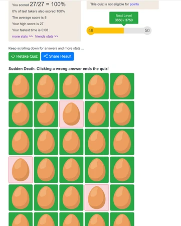
The image below is user Gekko0923 getting a perfect score on my infamous Don't Crack the Eggs! quiz. It is pure luck, and I can't fathom the number of tries this massive accomplishment took to get! Others have since cone this too, yet Gekko was the first to do it :)
Conclusion
That wraps up the second part to this series. I'm drained of ideas, and I don't know why you would need anymore anyways. Have fun using these, and congrats to Gekko for his achievement on my quiz! I think the names for these styles are kind of whacky, but you get the ideas lol. Thanks for reading!