Some Redesigned Country Flags
First published: Friday January 24th, 2025
Report this blog
Intro
Of all the country flags in the world, some stand out more than others. Whether it be the color selection or a cool emblem, flags can have different meanings and strike different feelings in the people who observe it. Today, I bring to JetPunk four redesigned country flags that I think are quite cool.
Of course, all country flags mean something. So, with my designs, I also explain why I chose to design them the way I did.
Redesign 1: Egypt
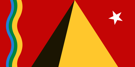
This new flag may seem clustered with all the new features. However, each piece does mean something.
Front and center is a Great Pyramid. I couldn't redesign Egypt's flag without including a pyramid. A drop shadow is added for needed detail. To the right of this is a star, which is supposed to act as the light source for the pyramid. However, you can interpret this star however you'd like, as I think many different meanings could be pulled from it. To the left of the pyramid are some wavy lines. The yellow line symbolizes sand dunes, the green line symbolizes the fertile soil provided by the Nile River, and the blue line is of course the Nile River.
Overall, I quite like this new design. It's clean, but a little chaotic and unconventional for an official flag. It is cool-looking, so tell me what you think of it.
Redesign 2: Russia
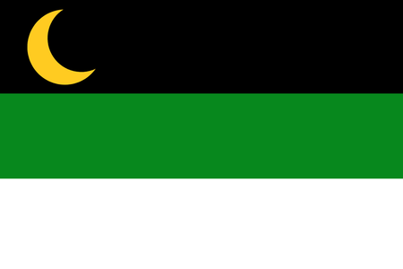
Not too different from the original flag, but it is "more unique" in my opinion.
I left the three bands, but changed the colors around. On the bottom is a white band which symbolizes the snow and ice of Siberia. In the middle is a green band which symbolizes some forests and nature untouched by humans. On the top is a black band which symbolizes the mysteriousness of Russia, also acting as a shadow to conceal their true identity. The yellow moon, however, acts as the light that shines upon their lands, illuminating the snow and giving life to the forests.
Overall, this isn't the worst redesign I have made. It is unique for sure, but I could see it becoming an official flag. It's organized, and the color scheme is nice.
Redesign 3: Estonia
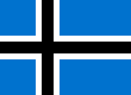
I've seen this redesign a couple times before, and I couldn't leave it out. There really isn't any lore behind it, as it's just made to match the other Nordic countries' flags. The colors go so well together like this, and I really hope they do use this redesign if a change does happen. Not entirely unlikely, but we would all like it (I think).
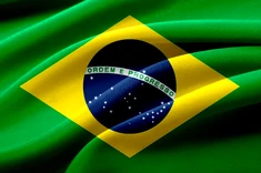
Redesign 4: Brazil
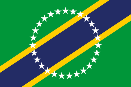
I've changed a lot with this one, but left the colors alone. Also pretty clean, I think this redesign is nice.
The background stays green to symbolize the lush rainforests of the Amazon. The yellow stripes symbolize all the "gold" (not literally, just great things) that can be found within the country. The blue stripe, similarly to Egypt, symbolizes the Amazon River. In the center is a ring of 27 stars, the same number as was on the original flag. These are just rearranged differently and placed in the middle. I suppose it could symbolize unity, but really I just thought it was a cool addition.
Overall, this one is actually my favorite, since the colors are the same, but the flag itself is completely different. The meanings for each item are also great in my opinion, so it earns the gold medal from me.
Tell me what you think about these redesigns and leave some feedback! Thanks everyone!
-
Estonia being an atheist state can't match, even though it's really close to the Nordics.
-
Egypt is too noisy but it reaches perfection to me, similar to flags like Maryland and Antwerp. Unfortunately, I don't think it could work out, especially with the Arab colors rarely appearing.
-
Russia can't match, only because in my opinion, the original colors make sense on a historic note.
-
Overall, Brazil strikes out to me and I would love seeing this flag hung up as Brazil's newest flag.
Egypt - A little too much and similar to East Timor's flag but turned on it's side.
Russia - Decent colours , maybe change the crescent to a hammer and sickle.
Estonia - Considering they are vying to join Scandinavia it's perfect.
Brazil - Just perfect, I could see this as a national flag.
Thanks for the feedback toowise!