
Brazilian State Flags Ranked from Best to Worst
Last updated: Monday October 5th, 2020
Report this blog
Hello! So, let’s start the ranking! The Brazilian flags don’t have creativity, but, let’s try rank them...
1. Pernambuco
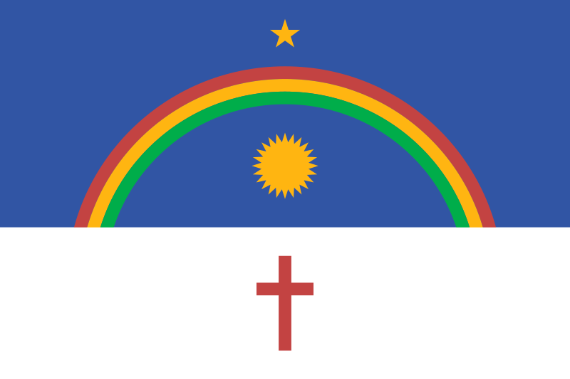
I don’t have doubt that this is the best flag. Creative, cool, marvelous and has a gorgeus aesthetics.
2. Tocantins
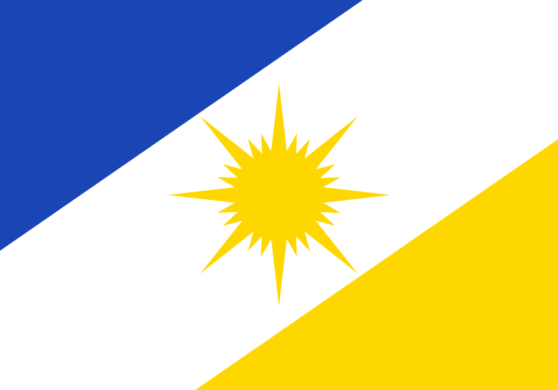
The well-designed sun in the center of the flag gives me a glow in my eyes.
3. Rondônia

Me opines a road that leads to the podium star.
4. Roraima

The line that represents the Equator Line, seems to me a tightrope for the balance of Roraima, and does not fall to the last positions of the ranking.
5. Maranhão

I think it’s a copy of São Paulo’s flag, but it’s beautiful.
6. São Paulo

Beautiful, but is copied from USA’s flag.
7. Santa Catarina

Cool, I just think the "Christmas hat", the "boxing glove" the "saci hood"... THE RED OBJECT strange on top of the star...
8. Paraná

Foliage details make this flag as cool, but the circle is a brazen copy of the Brazilian one.
9. Rio Grande do Sul
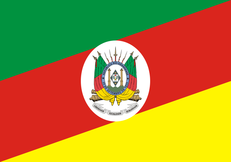
I think that diagonal lines leaves the flag beautiful, but if had the classic gaucho chimarrão on the coat of arms, it would be better.
10. Minas Gerais

My dear state... why you disappointed me? A red triangle in a white rectangle?... the best is the deserved motto in Latin: Libertas Quæ Sera Tamen (Freedom, even if late).
11. Rio Grande do Norte

A classic flag, but a little cafona, especially the coat of arms.
12. Bahia

Good, but I think it’s a mixture of copies of Texas, Chile and USA.
13. Mato Grosso

Good, but copied from Brazilian flag.
14. Goiás, Piauí, Sergipe

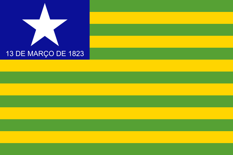

I NEED to put them together. They are basically the same flag! And are US copies in style à la brazilian.
17. Rio de Janeiro

It looks like a flag of failed iate club in Itanhaém/SP... or San Marino’s flag...
18. Ceará

Copying Brazil, and it would be better if the coat of arms had that northeastern leather hat.
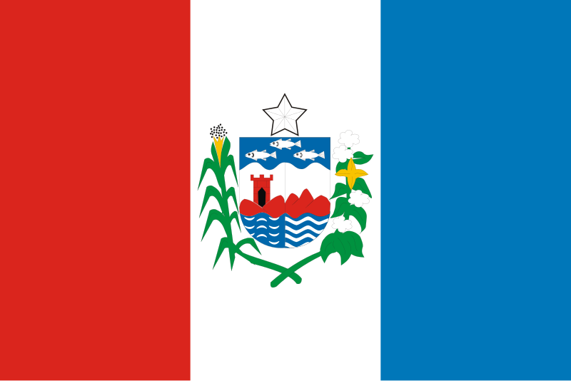
19. Alagoas
Sincerely, nothing to say. It’s too much normal, like the state...
20. Mato Grosso do Sul

It looks like DR Congo’s flag...
21. Acre

Prehistoric flag, just like the state (Brazilians will understand what I mean.)...
22. Pará

Can be a flag of a country in development, especially the Caribbean countries. Joelma and Ximbinha thank you, Pará.
23. Amazonas

It looks like a bad copy from the United States’s flag, or Samoa’s...
24. Amapá

They wanted to copy South Africa or Vanuatu, and it almost took a round 0 for the result. And what’s the object in the left of the flag? A earring?
25. Distrito Federal

Finally, the 3 worst. DF, it like a logo of a company, not a flag of subdivision of a country! A little dull...
26. Paraíba

Sorry, @IAB. I know that you live in Paraíba, but the "NEGO" (deny), that sometimes I read "NEGO" (sometimes used to designates black people in Brazil), is the only thing in this flag that pay attention of the reader…
27. Espírito Santo
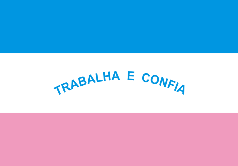
MAN! SEE THIS! S.E.E. T.H.I.S.! IN ADDITION TO THIS, WHAT FLAG HAS PINK!? (the lion in the coat of arms in Spain’s flag is pink, but..) It’s like one of the flags of... of... the LGBT community! I want to say swear words about this, but it’s best for me not... please ES, change this aberration...
Liked? So stay open to the news here on my blog! Thank you very much for that minute of attention, and until the next post!
Mas eu jogo o de bandeiras e alimentos
eu crio uma sala dai tu entra
mas nos 2 tem q tar online ao mesmo tempo